If you like seeing these, leave a comment below and let us know what you think! I may create some video tutorials on our editing processes if there is interest. All of the images below are some of our signature formal shots which we take the time to create at every wedding.
As with any art, the art of photography leads us to many failures that can often work out for the better. Most people only see the finished product from what we do, but with this post we hope to shed some light on what really comes out of the camera and what we have to do to get it to something that looks good. I almost always have shots in my head that I want to get when shooting weddings but as most everyone knows, time is usually limited and we don’t always have the ideal conditions to create the exact image we want. More often than not, our test shots turn out to be some of the best images after a little Photoshop magic. Telling someone your just taking a test shot relaxes them to the point where they aren’t worried about how they look. Some of the best interactions and poses come from this. Otherwise, many these shots would technically be considered failures.
We’ve never really shown much of what our images look like unedited. So for the first time you get to see how bad some of them look SOOC, but how nice they can become with a little work.
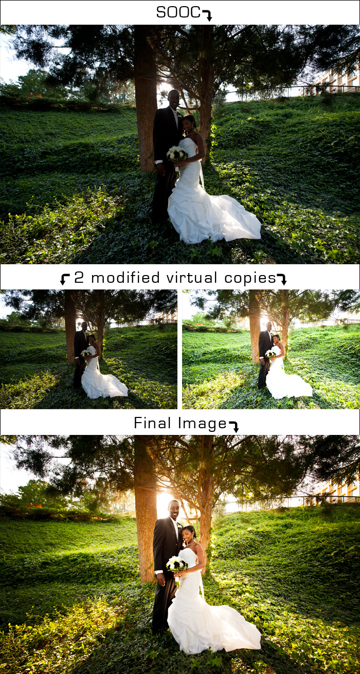
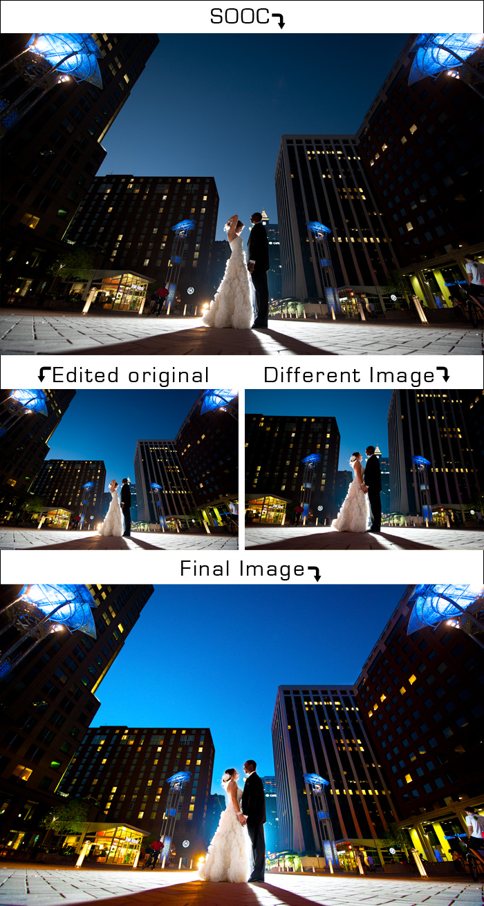
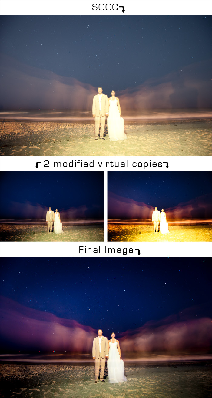
SOOC = Straight Out Of Camera. As it was originally taken without any editing or corrections.
Virtual Copy = This is the same image with different adjustments which we use to combine with the original and/or other virtual coppies in Photoshop to create the effect we want.
The following picture of Margaret and Lorenzo was almost completely overlooked at first. It was terribly under exposed and was a test shot simply to give me an idea of how to set up the shot, but as I looked at it, I thought I could surely turn this into something nice. It is a prime example of why shooting in RAW is so important. If this was shot in jpeg, I would have had to completely reject this image.
For this image, I really liked the composition of my test shot where Lindsey is adjusting her hair but didn’t have any other pictures like that one. I decided to use another more zoomed in shot of Lindsey and Dale where they actually looked good and combine it with the test shot to create a more dynamic image than we would have otherwise had.
This image was created due to the effect I saw in camera while taking test shots. We used the ambient light from the reception location to light Katie and Brant over a 30 second exposure. For the first 15 seconds they stood dead still, then on our cue they separated and slowly walked past each side of the camera for the remaining 15 seconds. We didn’t realize it until we viewed them on the computer, but Sarah was casting a shadow on Katie’s motion blur which you can clearly see in the original. I used part of the motion blur right in front of the shadow to clone and scale over Sarah’s shadow.
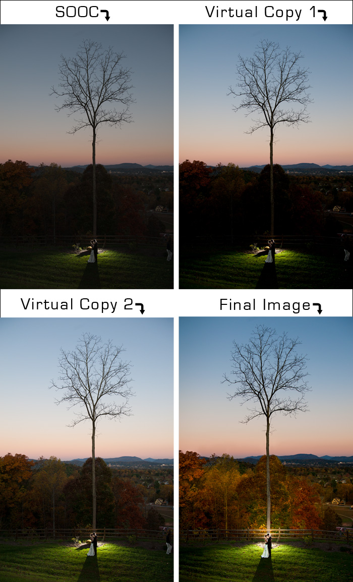
The lighting in this location was absolutely gorgeous to the naked eye, but didn’t quite translate when looking at the picture in camera. I used the natural direction of the sun to help enhance the lighting with a few curves layers after warming it up and bringing it into Photoshop. I knew what I wanted to do with this image because the final image is what I saw when it was taken. I just needed a little help from Photoshop to get there.
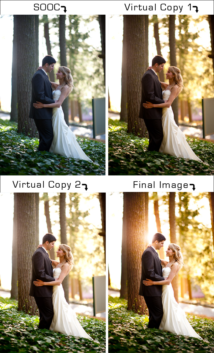
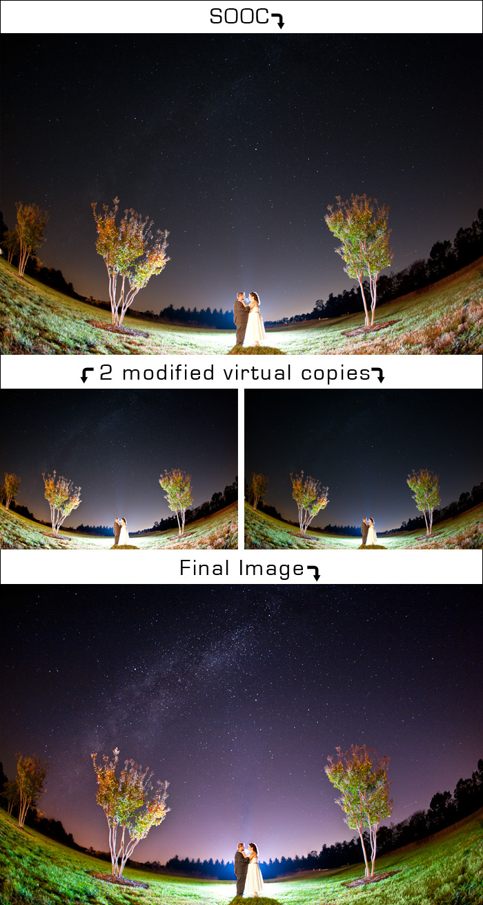
The night of Jenni and Daniel’s wedding was perfectly clear leaving all of the stars beautifully exposed. I liked the symmetry of the two Crepe Myrtles against the night’s sky, so I placed them in between the trees and used a backlight to add a little drama and used a fisheye lens to capture as much of the beautiful sky as possible. In Photoshop I corrected the color of the grass and sky and balanced the tree line behind Jenni.
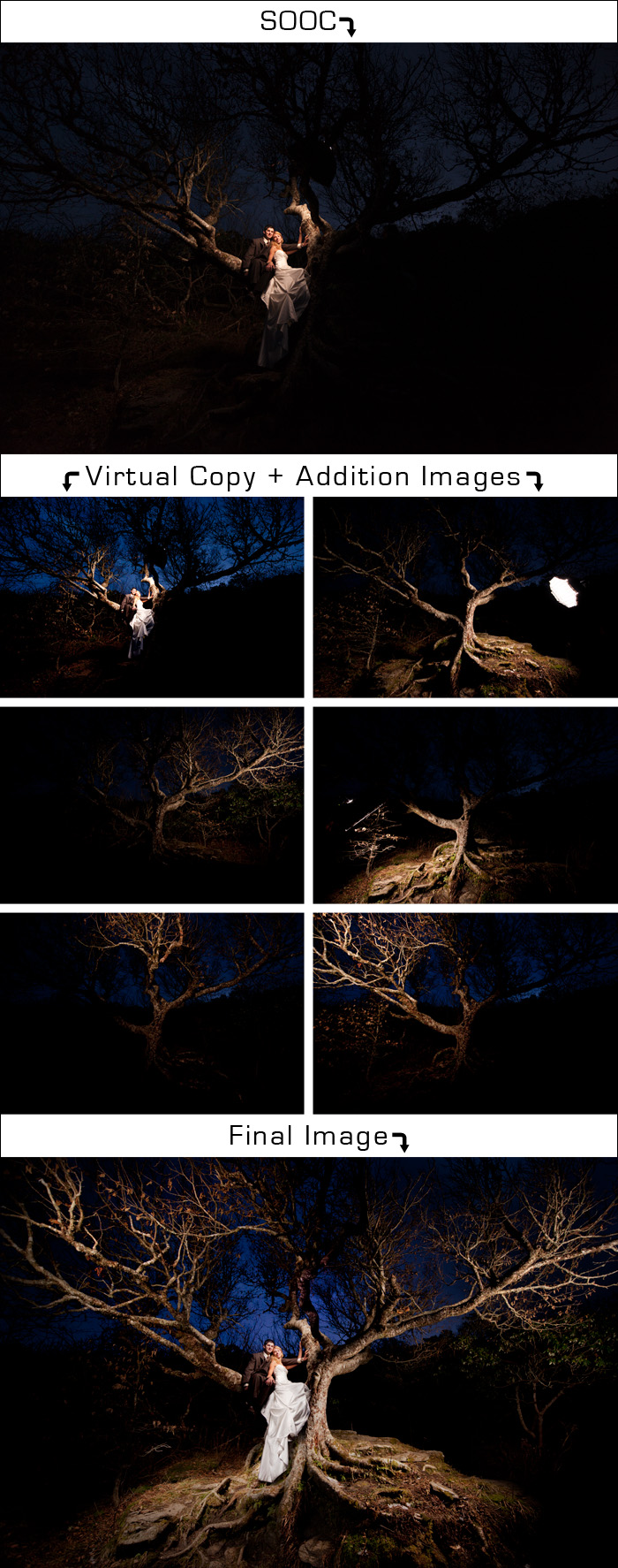
We were at the very end of our day after session with Tom and Tracy when this picture was taken. We were all about frozen at this point after climbing to the top of a mountain on the Blue Ridge Parkway. We passed this tree on the way to the top and I knew we had to get a picture with it on the way back down. By this point it was nighttime so I initially tried a couple of long exposures with our tripod, but wasn’t compelled by what I saw. Since we were lugging around sutio lights I figured we should paint the tree with light and combine the images later.
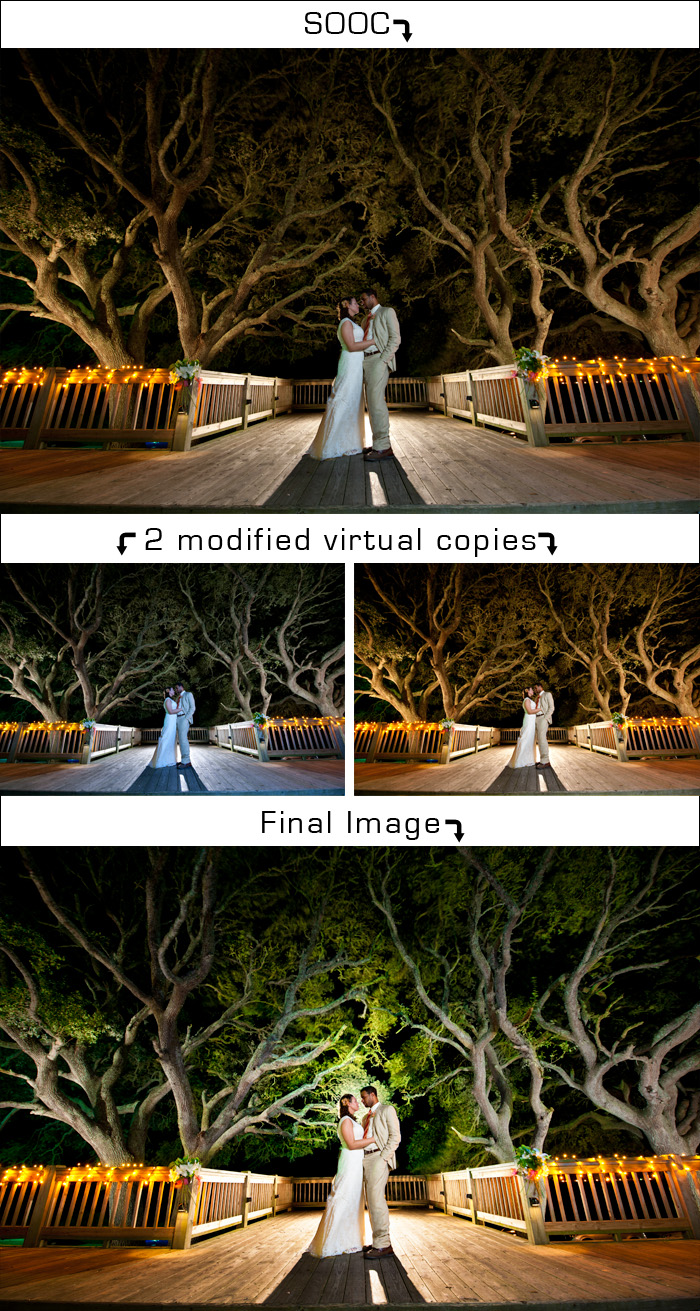
For the picture below, we used backlighting with a flash and CTO gell to balance the color of light with the color of the lights wrapped around the railing. Doing so took out the beautiful green from the trees, so instead I adjusted the white balance to get the trees back to their natural color and composited that with the original and then used Photoshop to enhance the color and lighting.
This shot came about by accident. I had a different image in my head when I asked them to stand by the tree, but once I took my test shot I knew this was way better than what I had envisioned. Again, the use of virtual copies and layers in Photoshop make this image come alive. Getting rid of distracting elements like Sarah on the right and the bush and it’s shadow on the left helps keep the viewer on what is important.
If you like seeing this kind of thing and want more and/or want a more in depth look into it, leave a comment below and let us know!

This is REALLY cool! Thanks for sharing!
I have been a great follower of your blogs. i really admire your pictures. Every day i look for new pics through my google reader in phone. i wanted to get great pics like u do. Thanks a lot for sharing this info. I really appreciate for spending so much time to help people like me learn! Thank you so much!
Amazing Thad, just amazing! I’m speechless… You truly have an incredible eye for photography!
I love this! It’s always so amazing to me to see all of the work that goes into any form of art. I so admire (and am extremely jealous of) your creativity. Keep up the great work 🙂
I really enjoyed reading this post, hope to see more!!
Very nice – thanks for sharing these images.
Wow, you guys are just incredible! I love seeing a little deeper into the process.
YES! This is awesome! You put alot of hard work into making the image come alive!
It’s amazing how meticulous and in-depth you get to make ever pixel come out perfect. Your clients (and friends) benefit immensely because of it. Glad you shared a bit of your magic with the world!
Awesome job guys! The tree painting is fantastic!
I’m already married, but if I ever get married again, I’m having you two shoot my wedding! I admire your creativity and skill in getting shots that always tell a story. I appreciate this “behind-the-curtain” view of your work and would love to see more.
Great work. Thanks for sharing.
Wow thanks for dedicating so much time to create this for us. Great to see where you can go with a photo if you know how to manipulate it in photoshop.
Love your edits and your artistic eye.
One question…in the first photo how did you make the light behind his head so much brighter? Did you use just add a layer and brighten it then erase everything besides that one area? It looks so natural!
I used a curves layer with a layer mask for his face. That was definitely the trickiest part to make it look right.
We love this post! I have the tree picture on my desk and everyone keeps telling me its an amazing picture and how you even did it. I’ll just send them this link now 😉 I think some tutorials are definitely in order!
I’m in love with the one in the tree! Gorgeous!
Thank you for the peek behind the scenes! I love your pics. You do an awesome job. And to see how you do it is too cool! Thank you!
These are great, ready for the tutorials. 🙂